CULINARIS





 INTERIOR DESIGN
URBA designed a supermarket for the premium chain Culinaris in Budapest, Hungary. Culinaris offers a wide selection of gourmet food and beverages, mostly imported from around the world and with a special selection of fresh produce, even small batch brands. With the respect towards the functional basic necessities in life, the words “simple” and “rational” were the foundation elements that tie the whole concept together. The coherent interior got rid of all disturbance and features only what is necessary.
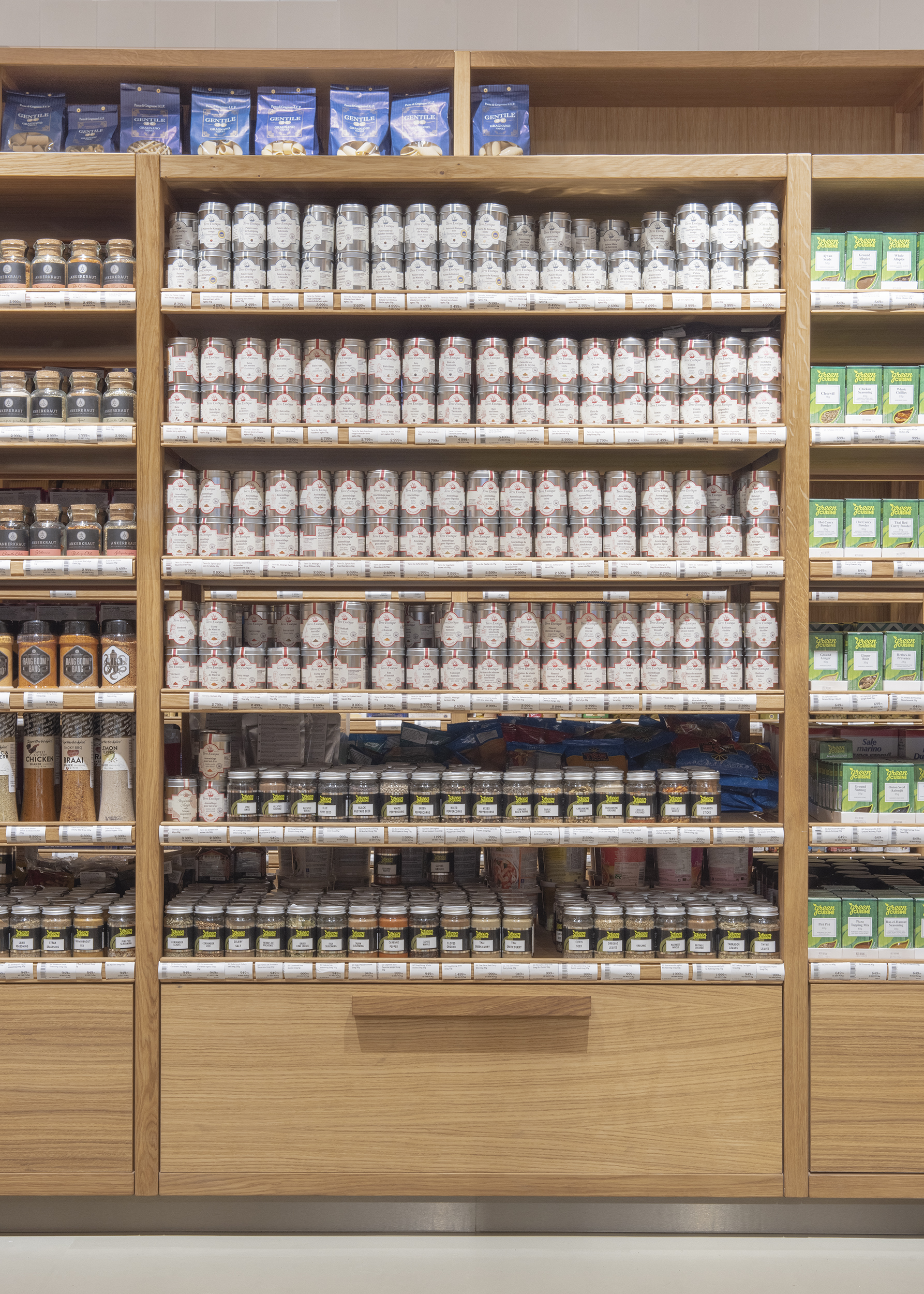
The design process started with an in-depth study of analysing product dimensions and optimising sightlines, followed by the effort that went into creating the most efficient product display, categorization and information approach in close collaboration with the Culinaris team. As a result, the stripped-back interior makes the shop's arrangement understandable and where products can take centre stage.
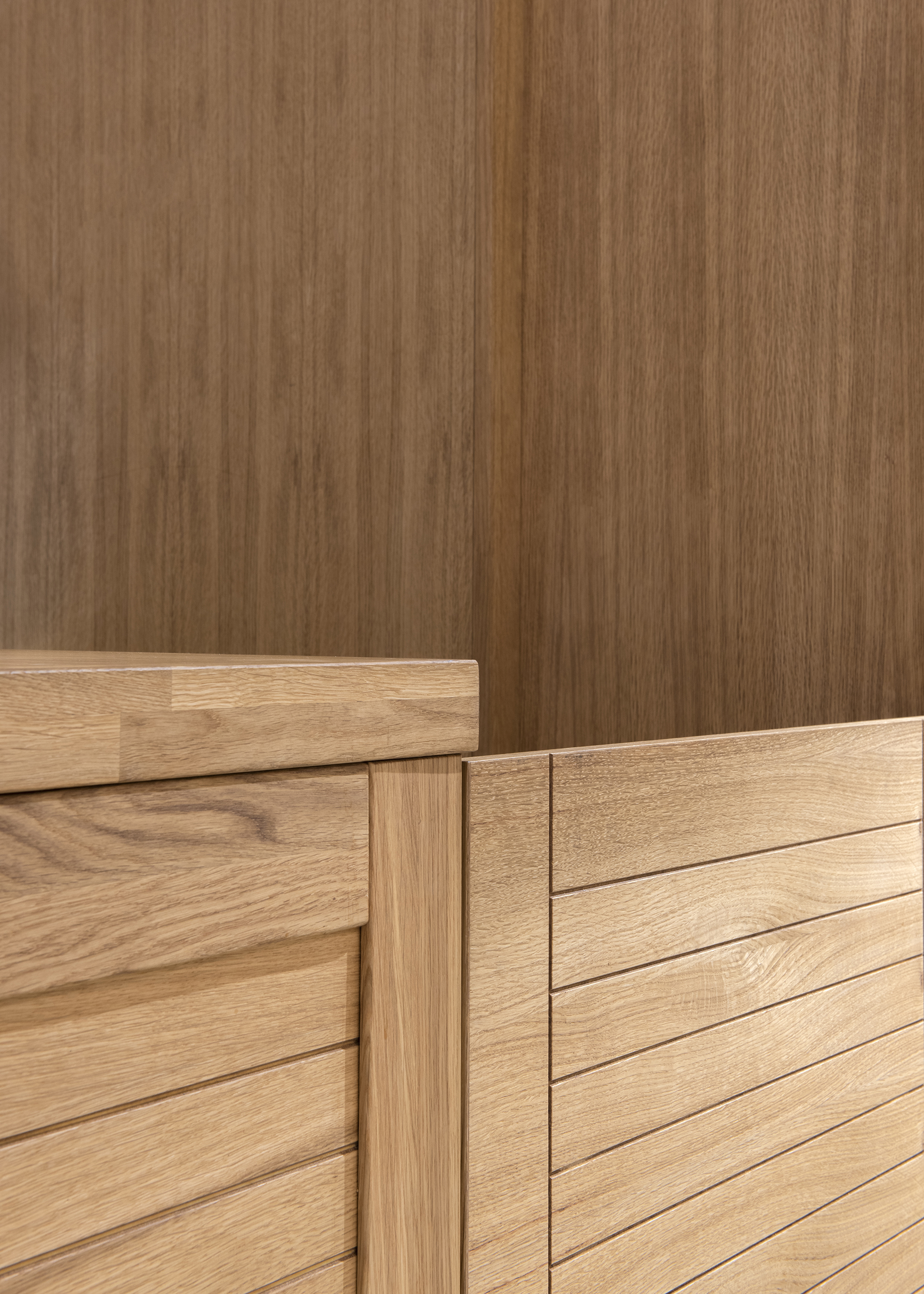
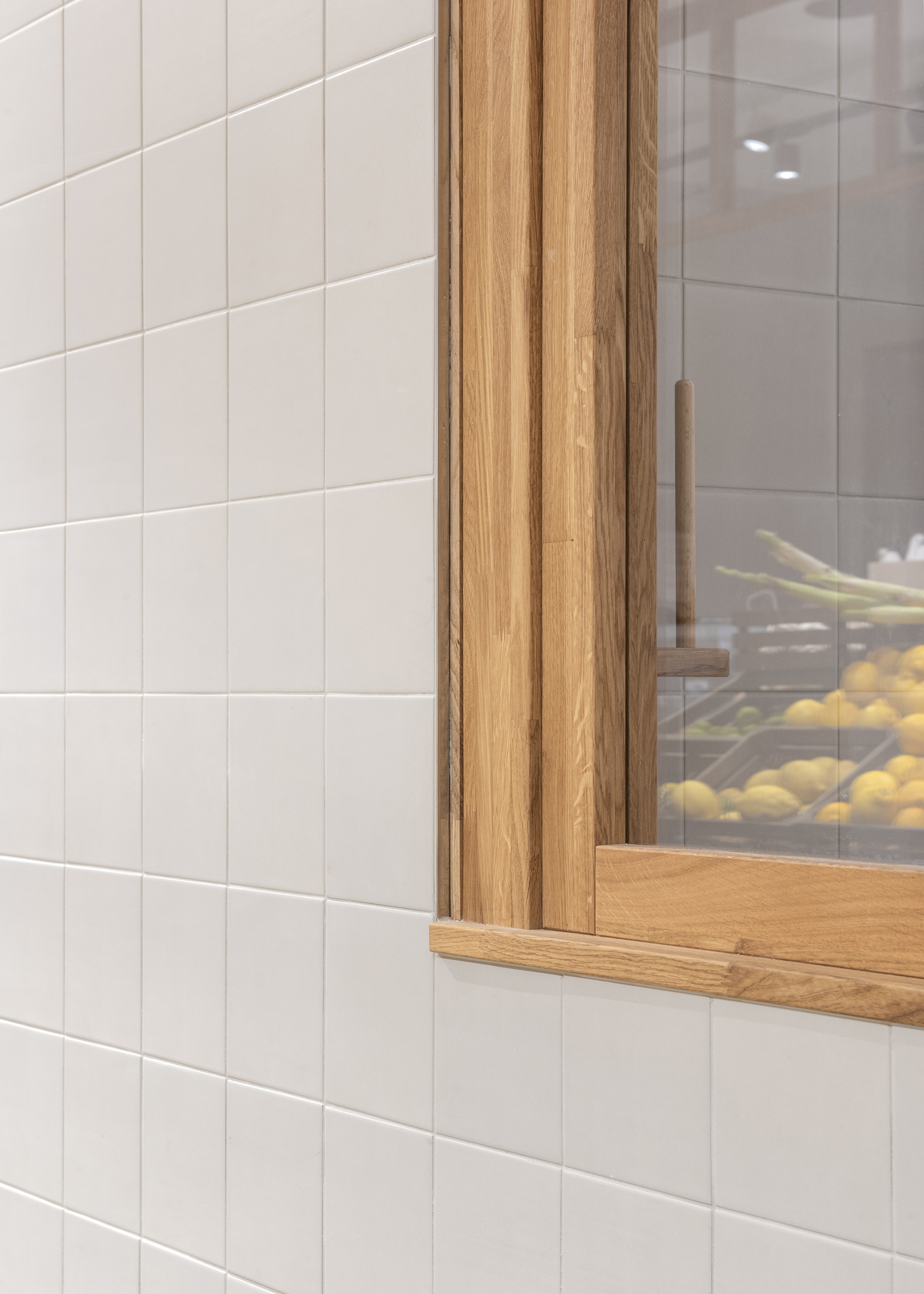
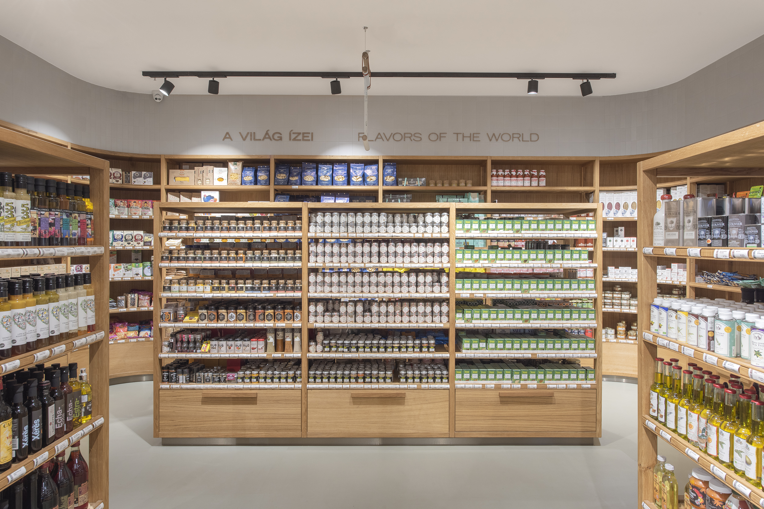
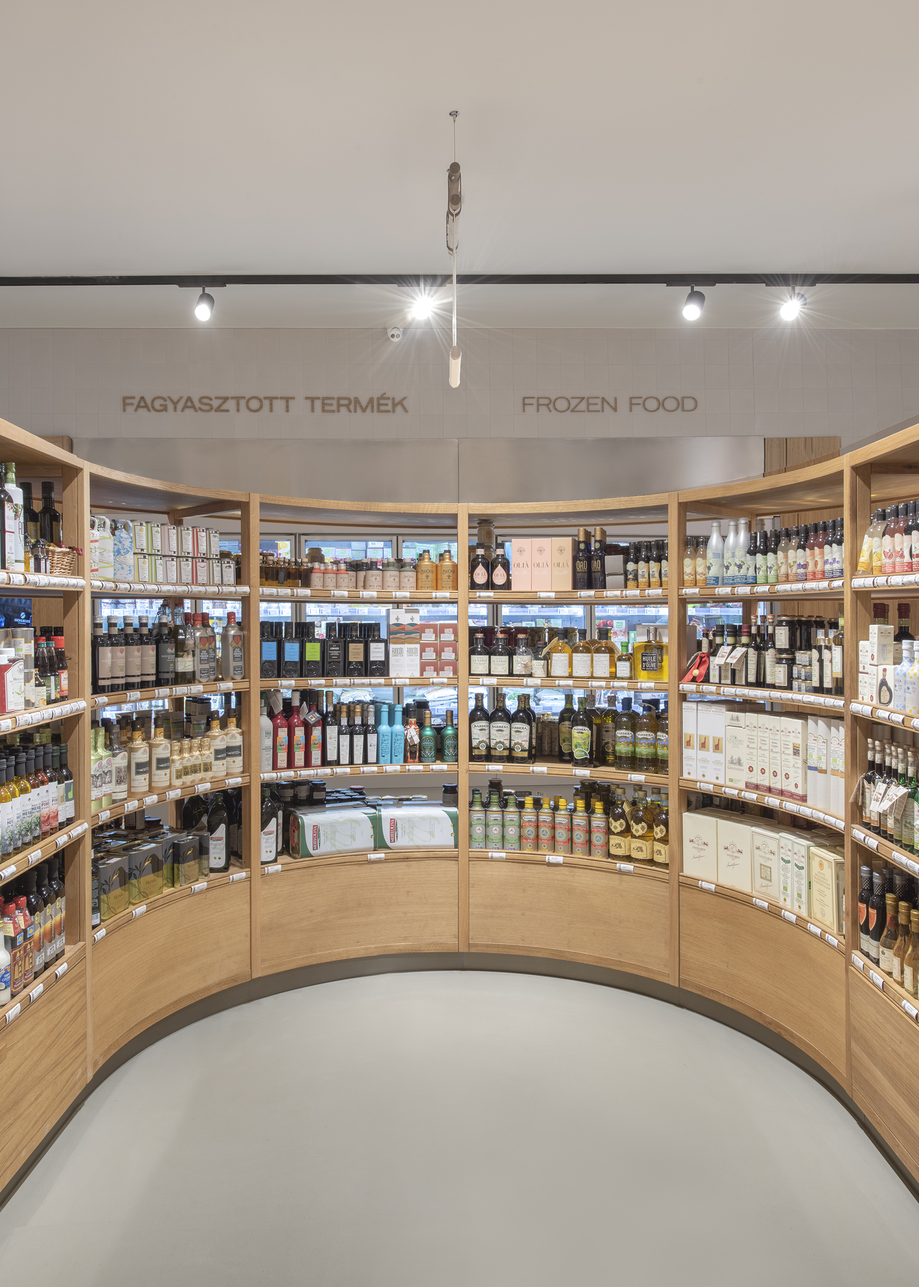
Throughout the store, natural notes and the usage of wood create a welcoming atmosphere and elevates the shopping experience. Culinaris has refreshed the shelving unit with wood edges to evoke the soul of a fresh market. The curved shelving islands are designed to guide shoppers around the store and discover a wide variety of products, whereas, in the fresh vegetable section, the idea is to create the experience of walking down the aisles of a local street market.
The outcome of rationalisation and simplification of retail design results in a timeless, functional and commercially successful space.
CULINARIS

Project team: Liza Natasa Rakusz, Marton Lengyel, Andrea Juhasz
Client: Culinaris
Area: 410 sqm
Year: 2022
Location: Budapest, Hungary
Photography: Matti Varga
Text: Lidia Vajda


URBA designed a supermarket for the premium chain Culinaris in Budapest, Hungary. Culinaris offers a wide selection of gourmet food and beverages, mostly imported from around the world and with a special selection of fresh produce, even small batch brands.
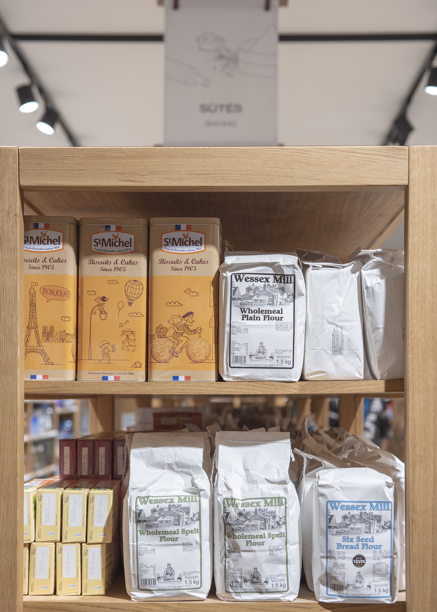
With the respect towards the functional basic necessities in life, the words “simple” and “rational” were the foundation elements that tie the whole concept together. The coherent interior got rid of all disturbance and features only what is necessary.
![]()
![]()
Throughout the store, natural notes and the usage of wood create a welcoming atmosphere and elevates the shopping experience. Culinaris has refreshed the shelving unit with wood edges to evoke the soul of a fresh market.
The curved shelving islands are designed to guide shoppers around the store and discover a wide variety of products, whereas, in the fresh vegetable section, the idea is to create the experience of walking down the aisles of a local street market.


The outcome of rationalisation and simplification of retail design results in a timeless, functional and commercially successful space.


 INTERIOR DESIGN
 INTERIOR DESIGN
 ARCHITECTURE
 PRODUCT DESIGN
